
In the latest installment of The Cartoon Companion: Ed Steed’s fowl: chickens or ducks?…plus Dernavich’s refrigerator, Cotham’s stairway to heaven, and more.
_______________________________________________________________________________
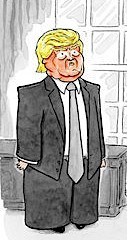 Tom Toro has been drawing a lot of Trumps lately. He talks about the experience on the Huffington Post: “New Yorker Cartoonist Explains Why Humor is the Heartbeat of Democracy”
Link here to Mr. Toro’s website
___________________________________________________________
The latest New Yorker features a Russian-inspired Eustace Tilley and Rea Irvin typeface.
You might wonder when the magazine has played with its look before. Here are just a few examples:
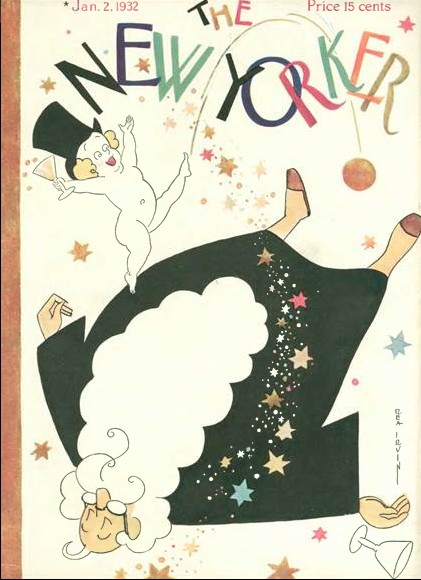
Rea Irvin (of course!) broke the mold first. Jan 2, 1932
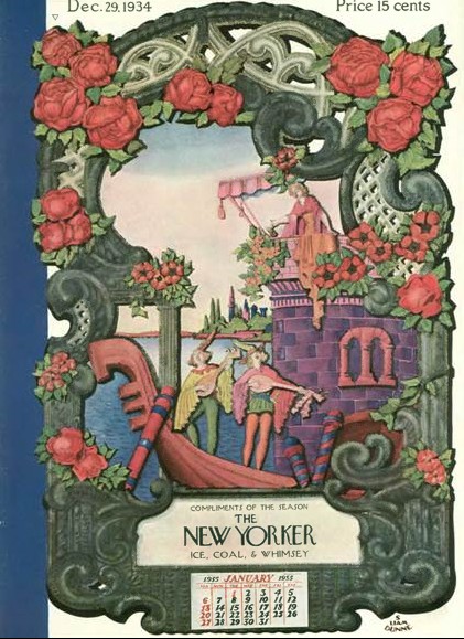
S. Liam Dunne in 1934
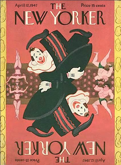
Rea Irvin (again) in 1947
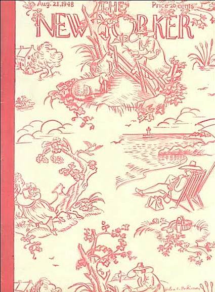
The one-and-only Helen Hokinson in 1948

James Stevenson in 1969

Mr. Stevenson again in 1973
Fabulous covers all! Playing with the New Yorker’s logo works brilliantly in each of these cases including Barry Blitt’s current cover. This may not be the time or the place to bring it up, but I was wondering…
You yourself have violated a different long-standing norm inside the magazine, that of the caption’s separation from the cartoon. I am thinking, of course, of your alphabet soup cartoon of April 11, 2016 in which the drawing extends into part of the printed caption. Has anything quite like that been done before?